- Design & Web
- Shipped
- Own product
The Archeon website
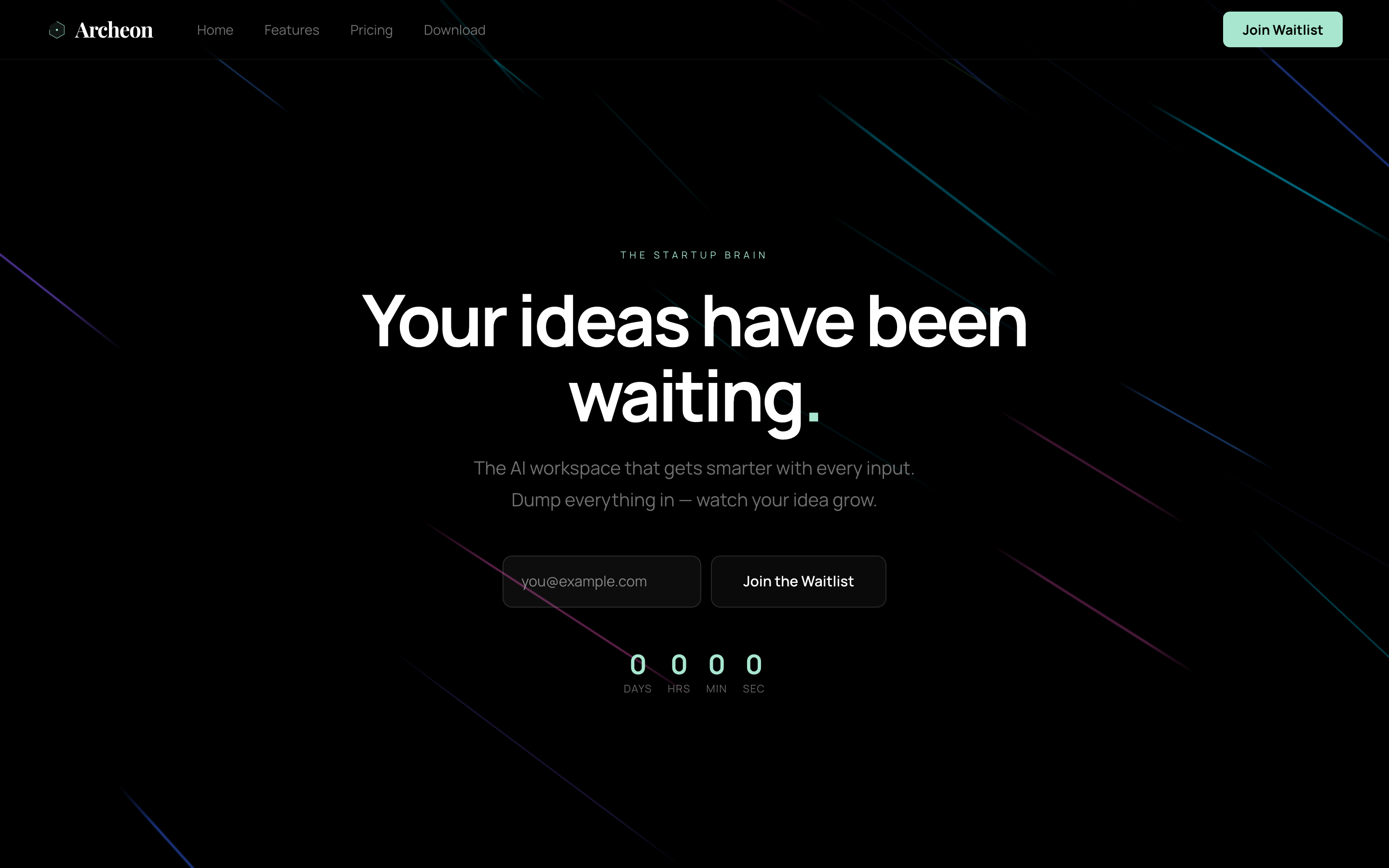
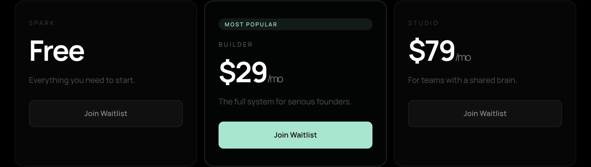
The public website for Archeon, our own product: the story, the features and the pricing, built as a finished, polished site with the product's own canvas drawn live on the page.
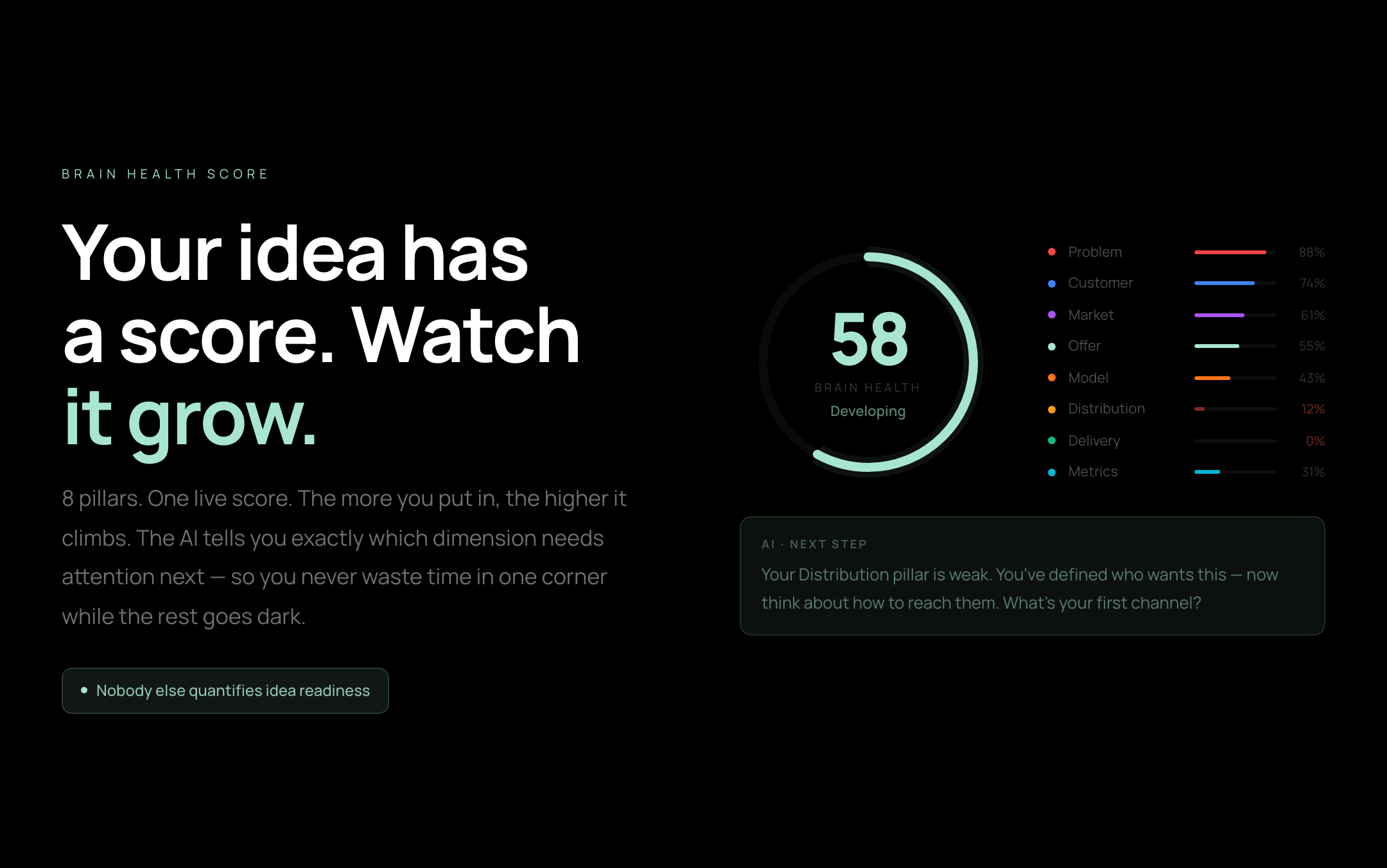
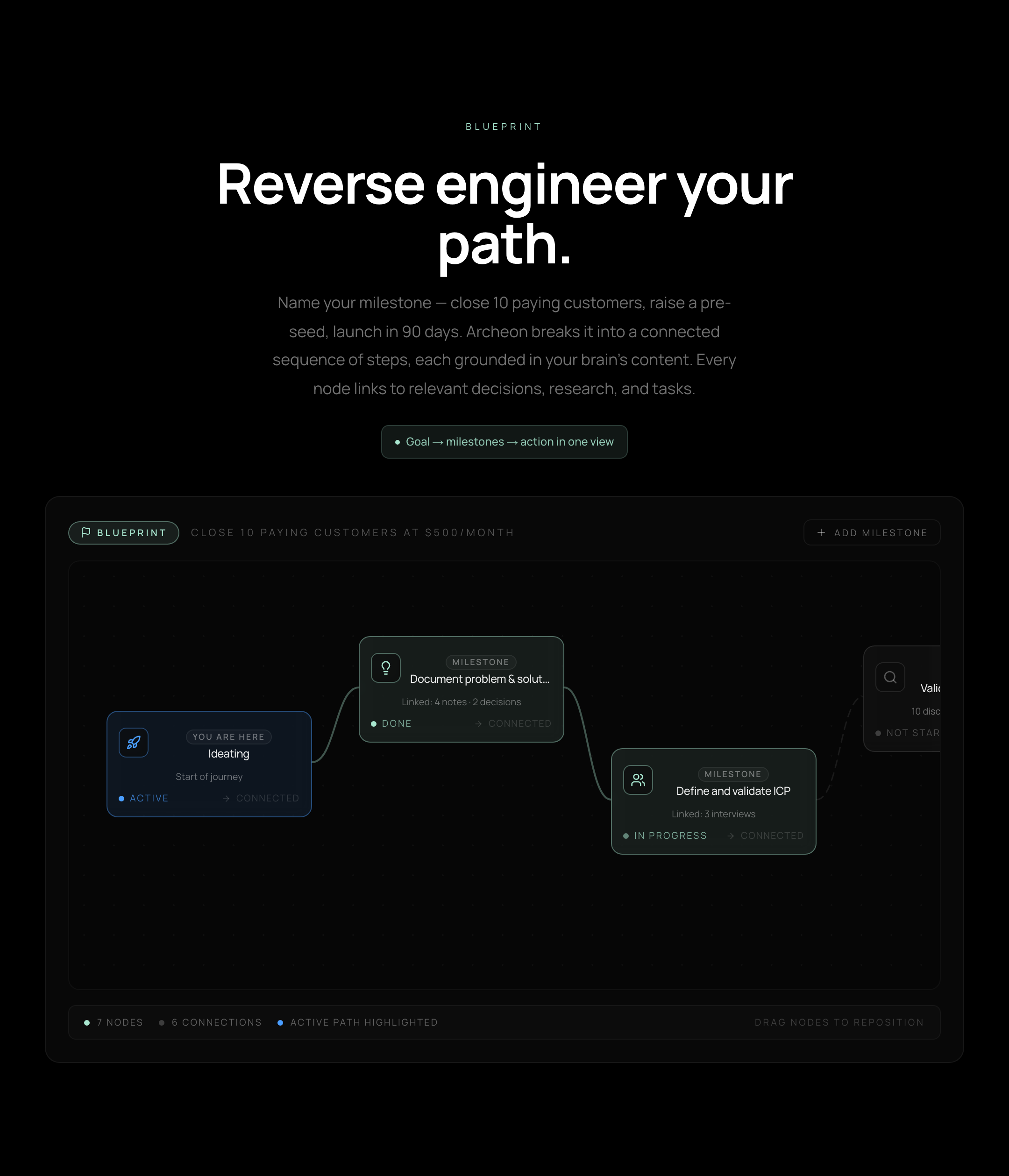
a finished website; the captures below are the site itself, and the moving section further down is its own code running here.
A look inside
The section, live
Not a screenshot of the site. The site.
One section of the Archeon website rebuilt here and running: the animated background, the icon cloud that steers toward your cursor, and the words that go with them.
The Reality
Now you've got a new idea.
But it lives in 37 tabs, five apps, a voice memo from the gym. Still no clarity.
The Archeon site's own section, running here: its background, its cloud, its words. Move the cursor across the icons.
The work
The problem
A new product needed a public site that told its story clearly, looked premium, and showed the product in action without requiring signup.
What we built
A full marketing site in Next.js: a hero over an animated streak background, a story that runs from the 2 a.m. idea to the 37-tab mess, a features page where each capability is shown as a working panel rather than a screenshot (the inbox, the eight-pillar idea spine, the brain health score, the blueprint canvas, gap and contradiction detection), a three-tier pricing page with a monthly and annual toggle and an FAQ, and a waitlist that is the site's one call to action.
- Next.js 16
- React 19
- Canvas animation, hand-built
- Supabase
The result
A finished, polished website demonstrating real design and build quality. Nothing below is a mockup: the captures are the shipped site, and one section of it is rebuilt here and running rather than photographed.
Evidence at a glance
- Full site: story, features, pricing, waitlist
- premium, distinctive brand feel
- every feature shown as a live panel on the page